Powered By Blogger

Saturday, 31 December 2016

Mise en scene in the cellar

Mise en scene

When filming our opening seen we wanted a large amount of focus to be put on the mise en scene, especially the props and lighting as we belived this would be the most effecive way to portray the film genre as well as hinting at where the story of the film was going to lead. 

Props

We had previously done a significant amont of research into religous symbolism which benefited us during the process of choosing our props to include in our sequence as it provided us with an idea of what would work. We gathered bibles and many candles as they would portray a clear religious asthetic. 
Within the house of the artists, we discovered several items
which we belived would be perfect for our set and to help produce the eery atmosphere we were aiming to acheive. We found these old books, (shown in the picture beside), which were extremely tattered and had several symbols on them. We thougth they complemented our film genre suitably so we added them to our set. Beneath them is an old wooden box which we also found amongst the items in the house. We thought this also complemented the theme we were going for and I was please with this find.


We placed a candel next to the accumilation of books and the bible which, I belive, transformed the set into soemthing much more eerier and spookier to look at. The candle had a metal holder which had intricate detail surrounding the base giving it an ancient and more effective appearance. The candel also prodcued adequate lighting to light up the area and using this ensured that the lighing would stay consistent throughout. 


In addition, we also found this chair which was clearly rather old due to the several marks and scratches it had attained. However, this gave it a more mysterious and synister look which we belived would work well for our protagonist to sit on. The rope upon it was also added to increase the effect of the mise en scene as it all worked together to produce a rather feared and mysterious appearance.


 We felt it was relevent to include a cross during the opening scene since we were inspired by the large amount of religious symbolism in the film 'Stigmata'. In order to create this we found two planks of wood and created one longer piece and one shorter piece. We then tied them together using string to create the cross formation. After this, we added some fake blood at the ends of the horizontal piece and at the bottom on the vertical piece to replicate the areas that blood would have reached during Jesus' crucifixion.


Once the cross was positioned in place and amongst the candles, we thought that the tattered and broken look about it worked effectively and complemented the tattered style of the books and the old walls. Several, tealights were added around the room which not only produced light but also created a very mysterious and dismal atmosphere. 


The Filming Process

The filming process

The location we finally decided on was in an old cellar. This was currently being used as storage space and consisted of such materials and objects like paint pots and building materials which filled the area completely, however we saw potential within the asthetic of the old walls and the dark space to create an effective filming enviroment once the contents were cleared. Therefore, we took time out of our filming scedual to remove everything and carry it up to the landing untill we were satisfied with the location and when we felt it was suitable to film in and would produce the best picture possible. This is a time lapse i created to show evidence of the task:


This process was very strenuous and took some time however, fortunately, we had accounted for this time within our filming scedual and we were very pleased with the outcome of the location after the clearing procedure:


Wednesday, 28 December 2016

Location Scouting - The Cellar

Location Scouting

The Cellar

Fortunately, my next door neighbour offered to lend us their cellar for our project. Shown below are some photographs I took of it when I went to visit.

The Main Cellar Room

This location is perfect for our chosen genre - it is dark, eerie, and decrepit. It is a fairly small area, approximately 5x5m, however it is just large enough to fit us and our equipment. The only issue with this location is the contents of the cellar, however as a group we will be able to shift the pots to the ground floor while we film.
The Cellar

The Stairway

The stairway is again eerie and dark, however it quite a confined space. It would be good for an establishing shot to let the audience know that the room is underground.
The stairway
Although it is difficult to make out, the image below shows the descending staircase into the basement. As you can see, the ceiling descends too meaning that we will have to be careful carrying tall camera equipment.
The descending stairs 

Pros of Using the Cellar as a Location

  • No natural light - the changing outdoor light will not affect us, so we can easily keep our lighting consistent 
  • Dark and dingy - conforms to horror genre
  • No noises or disturbances - our video will not be interrupted
  • Toilet facilities on the ground floor
  • Next door to my house - we can take breaks filming and can travel easily to the location
  • The location is safe to visit

Cons of Using the Cellar as a Location


  • It may get cramped with all four members of our team present
  • It may be difficult to illuminate 
  • Unloading and reloading the cellar will be time consuming
Overall, it is likely that we will use this as our location as we are all happy with its aesthetic, and are confident that we could get some really effective shots from it.


Filming Schedule

Creating a Filming Schedule

As a group we decided that it would be wise to create a filming schedule to try and organise our time efficiently.

As our film opening will include fairly complex aspects of stage makeup, we need to ensure that we aim to film all of our scenes involving the stage makeup on one day, to avoid any inconsistencies within the míse en scene. 

The day we have chosen to start filming is 28/12/16. We decided that we would use this day to film all our scenes involving the protagonist and the stage makeup. The other scenes (the contents of the protagonist's flashbacks), for example the shots of the Church, will be filmed on a different day. 

The filming schedule for the 28/12/16 is as follows:

0900: Meet at location (my house)
0915: Gather and organise míse en scene items
0925: Carry all the míse en scene items to our location (the building conveniently next door)
0945: Clear out the cellar, moving all the paint pots and other items to the landing on the ground floor
1130: Carry down all our míse en scene items; the chair, stool, books and candles
1145: Gather the two pieces of scrap wood and using hemp cord, bind them together to form a cross
1200: Apply blood to the cross in the areas of crucifixion
1215: Arrange the items of míse en scene appropriately
1230: Trial different lighting techniques to sample which looks best on camera
1245: LUNCHBREAK
1330: Begin filming all the scenes that don't involve stage makeup
1445: Apply SFX makeup
1545: Film the rest of the scenes involving the SFX makeup
1700: Remove SFX makeup and place the paint pots back into the cellar
1900: finish

It is inevitable that minor inconveniences will happen, and we have accounted for this in our schedule. However it is possible that we will continue our filming day beyond 7pm.

Location Scouting - Art Studio

Location Scouting

The Art Studio

A family friend of mine happens to be an artist and kindly offered to lend us their art studio to film our project. Before we finalise our idea, I decided to visit the studio and take a number of photographs showcasing the decor of the studio.

The Entrance

The studio is situated in a Victorian edifice, so the walls are tarnished and the ceiling plasterwork is ornate and decorative. This gives an eerie feel to the building, and if used with a low key lighting set up could be very effective. However, one issue with this area of the building is the blue doorframe - these perhaps ruin the antique aesthetic to the hall. It may be better to use a quick shot of the dilapidated walls rather than a lengthy scene in the hallway.
A shot of the building's entrance from the staircase

A high-expoure shot from the front doorway

The Studio

The studio is cluttered and busy - however there are a number of interesting props we could use. The aesthetic of the studio could be effective in a more arty piece, however for our genre of choice it would probably not be particularly effective.
The mantlepiece

The Studio
The parts of interest I picked out included:

  • The victorian mantlepiece - this could be cleared and used
  • The rustic mirror leaning against the wall on the mantlepiece
  • The antique painting hanging on the wall above the mantlepiece

Hallway #2

The second hallway has an interesting wooden mirror with ivy on it - this could potentially be used to film a shot from the reflection of the mirror. The style of the mirror and paintings emphasises the rustic aesthetic that typically is associated with the horror genre.
Hallway #2

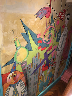
 The Mural


Although the mural is an interesting aspect of the art studio, its lively aesthetic is unlikely to do us any favours in terms of filming a horror opening.

The Spare Bedroom

The spare bedroom features a large mirror, which again could be used for an interestingly angled shot. I also am keen on the lampshade, which is very rustic. With a low key lighting set up, I think that the furniture in this room could really have an eerie feel to it, as the paintings on the walls and the ubiquitous patina have a very captivating aesthetic. This style of decor is commonly associated with the horror genre, so fits well with the codes and conventions of horror.


Overall, I think we could definitely take some interesting shots from this building, however it is unlikely we will use it as our main focal location. We could also borrow some of the interesting props and transport them to an alternative location.


Tuesday, 20 December 2016

Film Certification

Film age ratings

U: Universal age rating 

  • suitable for all audiences ages four and over
  • set within a positive framework
  • should contain reassuring counterparts to any violence or discrimination
  • no references to drugs, sex, violence, nudity or antisocial behaviour

PG: Parental Guidance

  • general viewing,  but some scenes may be unsuitable for children
  • discrimination is very unlikely unless in historical context
  • no reference to drugs unless they carry an anti-drug message
  • No glamorising imitable behaviour
  • Mild violence is acceptable
12A & 12: Suitable for 12 & over
  • misuse of drugs must be limited and infrequent
  • no promotion of imitable behaviour either 
  • strong language may be allowed but not too frequent or too explicit
15: Suitable for 15 & over
  • The work as a whole must not encourage discriminatory language or behaviour, even though there may be homophobic or racist themes
  • Sexual activity may be shown but not in strong detail. May be strong verbal references to sexual behaviour but the strongest references are unlikely to be acceptable unless justified.
  • The violence shown may be strong but not prolong the pain or injury. Strong gory images are unlikely to be acceptable and the same goes for sadistic violence.

18: Suitable for 18 & over

  • Clear images of real sex, strong fetish material, sexually explicit animated images, or other very strong sexual images will be allowed and will be confined to the R18 category

R18: Restricted 18 

  • Restricted 18 films are only to be shown in specially licensed cinemas, or supplied only in licensed sex shops, and to adults only
  • The R18 category is a special and legally-restricted classification primarily for explicit works of consenting sex or strong fetish material involving adults.

Friday, 16 December 2016

The Rule of Thirds

Research on the Rule of Thirds

When shooting scenes for our film opening, we want to maximise the effectiveness of each and every shot. The rule of thirds is a theory divised to ensure that each shot is appealing to the eye, as well as keeping its symmetry and balance. The rule of thirds applies both within photography and film.

An image composed with the rule of thirds
The theory is based on scientific research that the human eye automatically and subconsciously gravitates to an insertion point when an image is split into thirds. The theory also states that the main focus and interest of the shot should be situation in the first and second thirds of the shot. The focus of the image can be placed on the right or left hand side, however it must remain within only the two thirds. This is demonstrated in the image above, with the building located within the right hand two-thirds.

How can we apply this to our horror film opening sequence?


  • When shooting over-the-shoulder shots we should ensure to keep the in-focus character within the allocated two thirds.
  • When shooting long-shots of architectural exteriors, we should ensure to keep the building aligned correctly within the thirds.
-Anna Humphreys

Analysis of survey

Analysis of survey

When reviewing our survey results, we analysed some of our key findings that we will take into deep consideration when filming our own opening scene and will be very useful when looking for inspiration for our own story line. They include:

Q- What time of day to film?


There was a clear result to this question as the most favoured time of day to film was at night. This may be because the dark setting connotes a more sinister and feared atmosphere which will be effective when achieving the horror genre.   

Q- Whether to include dialogue or not 

We thought this was important to ask as when watching previous film openings there was a huge variety with the use of dialogue. We found that most believed it would be more effective without dialogue therefore we will try to keep it at the minimum when filming our opening scene.

Q- What age should our characters be?


From this question we identified that the age range 18 to 25 was most desired group of people. If we are unable to find actors within this age range we would be prepared to adapt our costume and makeup effects in order to meet this

Q- How should we deceive the killer


Our results present the conclusion that concealing the identity of the killer will be most preferred. This was closely followed by the 'masked' option. Therefore, we will incorporate the technique of ensuring the identity of the killer is not visible to the audience.

Q-General comments about horror film expectations 


We had a variety to responses to this question covering a range of topics. One in particular that gained our interest was 'possession' and 'religious imagery'. This lead to us down research on religious symbolism and see how we can develop those ideas into a horror film. We were then inspired to watching some religious possession films such as 'stigmata'. Other responses mentioned the idea of building up suspense as this is a main desire for a horror film. we feel this can be achieved with the technical use of sound and by creating fast cuts during a scene using postproduction as this is a would of building up tension. Others mentioned about the setting; 'dark setting' 'pathetic fallacy', and these comment all create an inspiration for us when creating our own story line.


Tuesday, 13 December 2016

Props research


Location Scouting - Christ Church, Erith

Location Scouting 

Christ Church, Erith

As part of our location scouting, we visited a small community church in our local borough. Shown in the video below are a collection of photographs we took to document some interesting aspects of mise-en-scene we could use within our film opening.

Some general research on the building let us to note that is a listed building due its traditional style and decorations. An old Church rather than a newly built one would be much more effective to film, due to its character and charm.

Pros of this location:

  • stained glass window could make a very effective shot
  • the Church is an old building (grade II listed)
  • the interior of the Church has a variety of religious artworks
  • the building is situation close to home, so filming on several days wouldn't be an issue
  • there is an outside space to film the exterior of the building
  • the building has bathroom facilities which would be helpful for a long filming day

Cons of this location:

  • getting permission for entry to the building with cameras may be a significant issue
  • the Church may not allow us to film shots of the exterior of the building
Overall, we decided that it would be unlikely we could gain permission to enter the building to film (however we will politely ask anyway). However, a few montage shots of the exterior of the building could be extremely powerful within our opening, for example shots of the stained glass windows or the wooden doors opening or closing. The general architectural structure of the Church could also feature within our opening, for example a short shot of the spire or brickwork.

Typography Research

Typography within Horror Film Openings

In a horror film opening sequence, the selected typography plays a large role in establishing the creative direction of the film. The feature of on-screen text often includes the opening credits; the names and titles of the production crew.

Within film trailers, the logo and branded typography features as the film title is shown at the end of the trailer. However, since we are creating a film opening rather than a trailer we will not be including the film 'logo' in the actual sequence.

Analysis of Horror Typography

Colour

When I searched 'horror+film+poster' in google images, a variety of posters appeared. As shown in the screen capture below, the majority of the film titles are written in a red text. 

Typography

Selection of popular horror titles
As shown above, many font schemes used within horror titles have a similar aesthetic. The lines are often ragged, with little to no straight lines. The fonts all have a handwritten quality to them, looking as though they could have been scrawled by hand.

Other common features of typography within horror include:
  • 'drips' of liquid coming from the letters - looks like dripping blood
  • splatters of colour - again, looks like blood
  • irregularly sized lettering
  • closely spaced lettering
  • entirely caps lettering - has a sense of urgency 
-Anna Humphreys

Monday, 12 December 2016

Coursework Inspiration - Stigmata

Stigmata

Due to our choice of genre and theme, we decided it would be helpful to watch the film stigmata for inspiration. Made in 1999 and directed by Rupert Wainwright, the film is about an atheist inflicted with stigmata after coming into contact with a rosary owned by a deceased priest who experience the phenomenon himself. As a group, we thoroughly enjoyed this film and thought it was really cleverly made in ways such as editing and sound. 


Here is a personal favourite scene for inspiration from others in my group:

What we found really effective was the editing during her experience of the stigmata. The constant cuts in the scene away from the present into another scene to create montage editing was extremely impressive. We are seriously considering using this sort of idea in our opening scene. This is because it assisted the viewer in understanding what was happening to Frankie (the victim) as well as create a fearful effect and strong spine-chilling atmosphere. 


We also really liked the muffled and broken up sound used to assist the effect the montage editing creates. The repeated screams and off-screen diegetic noise of the nails and hammer, along with the low and barely visible lighting, helps devise trepidation among the viewer as it is constructing how fearful the actual experience is for the victim. It assists the viewer to get into the head of the victim and understand and empathise with what is occurring to her, creating a relationship with the victim which will overall result in a bigger impact on the viewer.


As you can see from the clip above, the opening is mainly based on religion which is a strong factor that we want to incorporate. The focus of the camera framing on religious concepts, such as the crucifix and the cross help to really emphasise the main factor behind the film and the stigmata itself. The lack of speech in the opening is a concept that we would like to follow as the mese en scene will hopefully be powerful enough, like in this sequence.

Here is my personal favourite scene from the film:


-Caera Mendez

Initial Ideas For Location

Initial Ideas for Location

For location, we are interested in creating a strong effect using mese en scene. So we would like to use locations such as:

Church


We want to include a lot of religious imagery in our opening, due to it being based on the concept of the stigmata. Therefore having it based in a church would be significant because you can include many close up shots in montage editing of religious concepts such as, stain glass windows and statues of the crucifix. This would make our our opening scene very effective because we would be able to incorporate religion as much as possible and really like it into our theme of stigmata, which would help in the understanding of our storyline for the viewer.

Abandoned warehouse


Using an abandoned warehouse would be very effective as it creates the concept and atmosphere of isolation and loneliness. The grey and dullness of the abandoned place takes the life out of it and emphasises that great fear of being alone in an unidentifiable and empty place.  It is also detached from society creating the sense of never returning creating the impression that the character is either going to escape or die trying.

Forest


Because a forest is so open and with no chance of hiding, it emphasises an inevitability of death and the no hope of escape due to wide span of a forest with essentially no end. Also, natural lighting can be used in a forest which will make the opening much more life like and relatable. As well as this, the  fear of the unknown can be accentuated especially at night when you cannot see things. We could seriously use non-diagetic off screen sounds of animals and rustling to fear the audience and build up tension.

Scary bedroom


This is one of our favourite ideas for location. This is because we can use mese en scene thoroughly to present the possession of the victim. We could really emphasise what is going on in the characters head through drawings on their bedroom wall and the mese en scene of their bedroom, which is usually the most personal and important thing to someone. So therefore it would really emphasise her personality and who is she through the location. And therefore assist the plot of the film.

-Caera Mendez

Friday, 9 December 2016

Research on special effects and makeup

Research on special effects and makeup

Makeup-
Special effects makeup is a vital element within the creation of a film. Wen completed professionally, it has the ability to transform the look of a character to produce a completely different analysis of them. It can be used to make a character to look more beautiful and attractive or conversely make them look horrific and terrifying.

In contrast to usual makeup, special effects artists will often make their prosthetics such as latex, silicone or rubber

After doing research i have found aspects to stage makeup that we should try to avoid:
-using fake blood which is too light
-Going over the top with blood and cuts
-Not blending he colour and the cuts into the skin to make it seem realistic
-Using pain or ketchup for fake blood


With the accumulation of liquid latex and fake blood we feel like we can  create the effects of cuts and injuries and make them look real. 

Edward Scissorhands (1990)


The character of Edward Scissorhands has completed a large procedure of special effects makeup i order to produce the final appearance of his character. Firstly, his bird-nest like hair gives a messy and reckless look. It not only emphasises Edward's wild and untamed character but it also strongly identifies the gothic genre of which the film is. In addition to his hair, Edward has been given a pale, white face. The pasty look of his skin is used to emphasise the scars he has on his face which appear to seen very realistic and slightly sinister. The scars also create an air of mystery as the audience may wonder how he got them in the first place. The dark makeup added around his eyes deepens his eye sockets which creates a contrast to the colour of his skin making him seem even more ghostly which portrays that he is not like the other characters.
Overall, his special effects makeup is very effective as it adds the subtle indications of a gothic genre without going over the top. This make it seem very realistic thus making the whole film more believable. 


Thursday, 8 December 2016

Coursework Inspiration - Woman In Black

Coursework Inspiration


We thought that this opening scene for Woman In Black was a really effective sequence. We especially liked the idea of the three girls jumping out of the window at the end of the sequence. This is because it is a similar concept of what we would like to include in our opening, as well as the fact that it goes against the usual conventions of a horror of significant characters dying at the beginning.


We were also thoroughly inspired by the mese en scene of the room and costume in harmony with the plot. The mise en scene created a sense of realism for the viewer as well as setting the scene of the nursery so you could understand the innocence of the children. This inspired us greatly to use mise en scene to assist the viewer in understanding the plot and making it more life like and effective in just the opening.

-Caera Mendez

Coursework Inspiration - Harry Potter

Coursework Inspiration


For our coursework, we have had an idea to incorporate a dream sequence including flashbacks to the previous day of the actors in the church. We have taken inspiration from the dream sequence of the Harry Potter and The Order Of The Phoenix. As shown in the video below.


We thought this sequence was very effective due to the montage editing. The continuous cuts to the dream and cut backs of reality creates an uneasy effect for the viewer. It also establishes an ambiguous effect as the viewer is unclear what is actually occurring in the dream. The quick pace montage editing of the dream and short shots really conveys the setting of the dream whilst still creating a unsure effect. Also, we thought the constant cut backs and close up shots of him whilst he is dreaming reminds the viewer of his fear and panic whilst experiencing the dream.

We also liked the use of low lighting to create a strong atmospheric effect. As well as, the diagetic sound of his breathing creates the sense of his fear and the non-diagetic sound of music builds up the tension and trepidation for the viewer.

We are therefore going to use this as inspiration for our coursework and maybe incorporate some of the concepts used in this sequence to create as strong as an effect as possible.

-Caera Mendez

Tuesday, 6 December 2016

Initial discussion for opening scene

Initial discussion for opening scene


BRAINSTORM-

  • Potential ideas we could include:
  • Ambiguity at the beginning- wakes up- blurred vision and viewer doesn't know where she is, flash back montages 
  • We gained inspiration for the flash back montages from the Harry Potter scenes was this is frequently included in them
  • Wakes up tied to a bed with holes in her hands in the crucifix position 
  • candles flickering
  • Post production night vision 
  • Blinks and contacts appear- match on action  
  • Heavy breathing
  • Close ups of her face whilst lying on the floor, we see flash back montages of her in a church
We were inspired by the film 'stigmata' to include a relies aspect to our 'possession' genre  so we then researched some religious symbols in conjunction to this-
  • We found out that the upside down cross is a symbol of anti christ therefore we were interested in including a close on the wall which slowly turns upside down
  • Secondly we saw that '666' was an implication of the devil which may be effective if we include
  • A lot of the relies scriptures were written in arabic so this may be something we include
  • Several montages of stain glass windows could be effective

Thursday, 1 December 2016

Research On Editing

Editing


Editing is the term used to describe association of shots and the way in which they are put together. 

Editing Terms


Match on action

Two shots that match and show continuity of space and time. For example, the opening of a door from behind and then from in the front made to look like one continuous action. 

Continuity editing

Creates a sense of realism as time is continuously moving forward. It is the most common use of editing as it does not draw attention to the editing process. 

Cross Cutting

When scenes alternate and interweave with each other, normally use to combine 
different locations, it builds tension and suspense as it is usually quick paced. (Sometimes known as parallel editing) 

Freeze Frame

Stopping a sequence in particular event to focus especially on a specific element. 


Jump Cut

A sharp transition in between either a continuous shot to highlight an advance in time or between two  similar shots for a sense of uneasiness. 

Flashback

A moment in a sequence when an event from previous time prior to the current narrative is shown.

Visual Effects

Used to change previously filmed elements such as removing an object from the scene or vice versa. 

Montage Editing

A series of unconnected sequences in order to create an effect with a meaning. 


Credits 


The information such as names of actors etc, at the beginning and end of a film.

Cutaways

A short shot that interrupts continuous action with an insert of another action. Such as an object or person followed by a cutback to the original shot.

Shot Reverse Shot

When one character is looking at another (usually off screen) and then the other character is shown looking back. 


-Caera Mendez

Horror film survey

Horror film survey

When creating a project that will be viewed by an audience it is important to do research to see what the general public would prefer. Therefore, I created a survey on Survey Monkey as this is an effective way to gain information to help target our initial ideas on what is currently most popular. Our questions focused on the presentation of the characters and the plot of our sequence. Here is the link to our survey: 


Create your own user feedback survey