Powered By Blogger

Friday, 28 April 2017

Agenda Setting Theory

Agenda Setting Theory 


This particular theory was suggested by Maxwell McCombs and Donald Shaw in 1972. It was originally suggested that the content that is presented in the media created a general public idea, in the sense that they can influence what to think, but they may also tell you what to think about. Within particular news displays, by editors and broadcasters, individuals can play an important part in shaping the view given to certain events in reality. Is often used in political ads, campaigns and news.


There are in fact two levels of the agenda setting theory:

- First Level:

The idea that the media uses objects or issues to influence the people what people should think about and this is m
ostly studied by researchers, 


-Second level:

Media attempts to depict focuses on the certain characters in society and influence peoples view about them.


Thursday, 27 April 2017

Research into Blumhouse productions

Blumhouse Productions


Blumhouse productions is an American television and film company, which was founded by Jason Blum. Blumhouse Productions are the known producers of Paranormal activity, Split, Get Out and insidious. We had to decide if we wanted to use Blumhouse Productions or Twisted Research. As we wanted out opening to maintain professionalism and be a success, we based success off of revenue as we thought that a successful film would gross more. On a whole, Twisted Pictures averaged a higher revenue which is one of the reasons we prefer it to Blumhouse. Also, because our film opening is an independent, low budget project, we could like as much assistance in terms of production as we can get.
However, Blumhouse Productions are known for their extremely popular but low budget films. As mentioned previously Get Out and Split being the most recently popular ones. Both films received high ratings for the intensity but intellectual plot lines.


Get out revenued over 30 million dollars in its first weekend alone on only a 4 million dollar budget. This shows the company's strength and ability in terms of producing films. However, as a group we decided that Blumhouse had great strength in psychological horrors, but Twisted Pictures seemed to be the stronger company in terms of our supernatural sub-genre. Therefore, after much thought we decided that it was best to go with the company that would be more suited to us, which was Twisted Pictures.

-Tibet Keskin

Final Piece- The Crypt

The Crypt


Shown below is our final piece. We were all very pleased with the final product and believed that we had achieved what we had planned to and more.


In terms of the process, we believe that our biggest struggle was creating a plot with smooth continuity that would make sense to the audience. It took us around four drafts to finalise our ideas and begin fully editing the opening. Another obstacle of ours, was the flashback. Primarily, we struggled to make the flashback look obvious to the audience without it seeming too exaggerated. So we played around with many effects and transitions to make sure we found the perfect one to portray our flashbacks. A final important obstacle of ours was music, we ended up having to layer multiple sounds to create our final piece, including low toned music, whispers, rain drops and tension building music. This is because our initial music was almost perfect, however, we all believed it didn't have enough tension or trepidation behind it, so we had to layer numerous sounds to create our desired effect.


Despite our obstacles however, we were very pleased with our improvements in our skills in Final Cut Pro and how the overall opening turned out! And we are looking forward to what we can learn, improve and create next!

-Caera Mendez


Uses and Gratifications Theory

Uses and Gratifications Theory 


The uses and gratifications theory is the study of the way the general public consume and react to media. It states that "consumers use the media to satisfy specific needs or desires." Meaning that many people will use social media, such as Twitter, to seek out entertainment along with the finding of information and to communicate with those who have also watched the programme, for example. Or alternatively, to show expression and opinions of a programme. The use of the social media after watching a programme or film, determines the reaction to the media and determine the way it is used.


A typical study of uses and gratifications explores the reasoning behind media consumption coupled with the consequence associated with it. For example, a strong example to use is the use of Twitter during the Britain's Got Talent live final. Many will often tweet their thoughts on each act and interact with others, doing the same thing. It has been identified that this media consumption is done for many purposes, including, relaxation, social communication and entertainment.

-Caera Mendez


Preliminary Story board

Storyboard for the Preliminary Task

Before creating our preliminary task, I decided to draw out a basic storyboard with sketches and notes to mark out our shots, ensure we include a match-on-action shot, dialogue, the 180 degree rule and a shot-reverse-shot.

Storyboard

Storyboarding our Final Piece

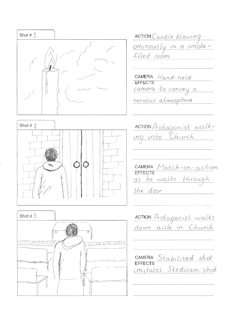
Before starting our final film opening, we decided that we wanted to create a brief storyboard of our plot and camera framing.

I made a template using a computer and hand drew a series of images that we wanted to replicate in our film opening. I also listed the actions and camera techniques used alongside the drawings.


Wednesday, 26 April 2017

Character Costume Deconstruction

Freddy Krueger - Deconstruction

Make up:

As seen in the photo the SFX make up and mask is one of the most distinctive things about the character.


It is clear from this image that both masking and SFX have been used to enhance fear in the audience and create realism that he was actually burnt in a fire. 
The use of the fake teeth helps to accentuate the rotten look he implies, however, it also helps to show that he is still human and still withholds human features, so makes it more scary for the audience as it creates realism.
However, the obvious reasoning behind the mask, is to show that he has been burnt in a fire and make the storyline seem as believable to the audience as possible. 

Clothing:

In terms of clothing, Freddy Krueger is always framed wearing the same clothes; the stripy jumper and dark trousers/jeans. This allows him to be distinguishable from others for the audience, but also helps him stand out easily as the colours of his top, do contrast to create quite a bright look.
Also, because the predominant colour is red, this signifies blood, danger and along with the black and dark colours, death. This assists in the foreshadowing of the character and his role in the film, although it may be seen as pretty obvious from the onset!
The hat, is to presumably to help cover his scaring on his head, and make it a little more watchable for the audience. But it could also accentuate his human features, and how he went from being a normal living man to a murderer, creating more fear and weariness among the audience.
The hat also often shadows half his face, creating low key lighting focusing on his face. This creates an ominous effect and makes him more fearful to the audience as they can not see directly what he is. 

Hand:


Finally, the hand is one of the most important aspects of the character of Freddy Krueger in all films. The four knives which are attached to a plastic glove, is definitely what completes Freddy Krueger's frightening image. It creates the feeling of brutality and fear among the audience, as they begin to see no one is spared. 
The discolouredness of the glove, also suggests it has been used plentiful times giving the impression that he has killed many.
Also, the concept of the knives replacing the nails creates him to be much more powerful and able than the average human being and almost unbeatable. 
Finally, it is a distinctive prop of the character, so assists to keep the brutal reputation of Freddy Krueger going.


-Tibet Keskin

Location Scouting - Bexleyheath Church

Location Scouting - Catholic Church in Bexleyheath

After a period of deliberation, we eventually decided on our final location being in a church in area close to our school: 


Pros of this location: 

  • Supplies a vast amount of mise en scene to work with so we could gather the best shots 
  • It is in an accessible location near to our school so we wouldn't have to travel far with the equipment
  • Provides toilets meaning we could work for extended periods 
  • No noises or disturbances during our filming hours so it is completed without interruptions
  • Permission to use this church was easily granted
  • In a safe location
  • Has prominent stained glass windows which work perfectly to gain some effective shots 


Cons of this location:

  • A lot of natural light which could vary throughout the day
  • The church was only open for particular hours of the day meaning we may have to alter our school scheduled in order to go there
  • Services and masses may effect the timings and availability of the church
  • Lack of electricity to charge our equipment

It is evident that this location provides far more positive aspects rather than negative thus it is likely that we will use this for our final location to film in.

Film Title

Film Title 

After completing our film opening, we were left with an immensely difficult decision of what to name our sequence. After hours of deliberation, we formed a spider diagram containing a huge variety of possible options:

We analysed all of our suggestions and formed a list of the top 5. We then did a survey for people to vote between our top 4 which were:
-The Crypt
-Possessed
-The Martyr
-The Sacrifice 

https://www.surveymonkey.co.uk/r/L3NZVD6

We then gathered the results from out survey and discussed the outcome to help influence out decision:

From analysing our results, we could see that 'The Crypt' was the most popular option followed by ' Possessed'. We thought 'The Crypt' was very fitting as a 'Crypt' is an underground room underneath a church and since we included a lot of religious imagery in our sequence this name complements the theme perfectly. Additionally, there were several shots of our protagonist in an isolated underground location which could represent some sort of crypt too. Therefore we settled with this option and used this to name our opening sequence. 

Editing Research

Research on Editing 

Editing software

Normally I would use Sony Vegas Pro but seeing as Final Cut Pro was the only available software within the school computers, I had to adapt and research ways to edit, as I was familiar with editing techniques but the methods in which I could achieve these techniques were completely different. Editing research was useful to me , as final cut pro was not an editing software I was familiar with.

Visual effects

A 'fantasy eye effect' on my eye to highlight the 'unknown' essence within the scene. This could have be done via Photoshop for every single frame within the short shot but that would be extremely time consuming, so using Final Cut Pro and I assigned two glossy eyes to some frames which tracked accordingly with the eye. Points were added on my eyelid so that when my eye opened, the glossy eye showed up with it. This ensured that the effect looks realistic and subtle. I found that the close up shot of my eyes coupled with the 'fantasy eye effect' had the most effect on the audience as I had asked several people if it was better with or without the effect and if it should be in a different camera frame.

Flashback


 I also had to research what would be the best way to represent a flashback and found that the 'flash' effect on Final Cut Pro would be the best to show a flashback. I also discovered via editing that a slight change in the colour, saturation and hue would be best to convey a flashback. Near to the end of the scene we thought that it would be most suitable to use quick cut editing using short clips as a montage to increase the tension in cohesion with the music. 

Transitions

The definition of a transition is 'the process or a period of changing from one state or condition to another'. In the context of film making, a transition is what the editor shows between 2 shots. The connection of the scenes is the transition. Transition can be the next consecutive scene, or it can be a fade or image change. To create our flashbacks we had to use transitions to change from one scene to another.

Target Audience

Who is our Target Audience?

Seeing as how it is typical the younger generation that enjoy watching horror films, we decided that our target audience was going to be that of teenagers and young adults.

Certification

However, seeing as our film fit the criteria for being an 18 certificate, we had to debate whether a film aimed at teenagers yet is an 18 certificate is a contradictory statement. After discussing whether we thought this would be an issue, we decided that a vast proportion of our audience would be teenagers aged 18 and 19, and young adults in their early twenties. Furthermore, we subtly acknowledged the fact that although slightly younger audience's would not be able to view our film in cinemas, the unfortunate inevitability of younger audiences viewing our film at home is apparent.

What do our target audience want to see?

Costuming

  • subtle costuming
  • realism rather than extravagance
  • casual, stylish clothing
  • modern, contemporary clothing

Imagery

  • visceral yet thoughtful
  • controversial (perhaps a focus on taboos)
  • set at night-time
  • violent scenes
  • lots of tension build-ups and releases
  • unpredictability 

Casting

Casting for the Role of our Protagonist

Actor 1:


- subverts the stereotype of the main victim being female
- of a young adult age range
- more experienced acting skills

Actor 2:


- conforms to the convention of the main victim being a young female
- would allow us to experiment with innocent, natural-looking makeup as opposed to heavy makeup
- of a young adult age range which would appeal to our target audience

 Actor 3:

- again, conforms to the stereotype of the main protagonist being a female
- feminine features and long hair
- developed acting skills

 Actor 4

- subverts stereotypical feminine victim
- of a young adult age range
- limited acting skills

Conclusion

In conclusion, we as a group decided that actor 1 was going to be our actor of choice. The fact that he is a member of our group means that he will have a similar creative vision to us when acting and portraying his role. Although actor 2 was also a member of our group, we liked the fact that actor 1 subverted the stereotypical gender roles often displayed in horror.

18 certificate films - survey monkey

SURVEY MONKEY


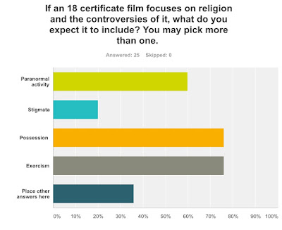
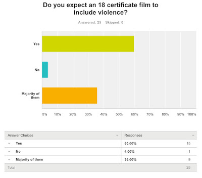
After we decided to certify our film as an 18. We decided it would be best to research what makes an 18 certificate differ from a 15 in terms of horror, so therefore we made a survey monkey to ask general members of the public. We initially thought to only ask over 18s, because we believe that it would only be appropriate to ask them, however, after much thought, we decided it would be best to ask people of all ages. This is because it will allow us to know why someone of a younger age would not feel comfortable watching an 18 and we believed it was best to find that out from the younger generation themselves. Here are some of the questions we asked and their results. 

From the results of this question, we inferred that our film definitely certified as an 18 as it included challenging and taboo themes, such as controversial religious aspects etc.

We were slightly shocked by this result, as our film does not include any extremely violent or fighting themes. However, we decided that not all 18 certificate films had to include this and as nearly half voted "only the majority of them". 

From this result, we were able to reinforce our decision of making it our film an 18 certificate. This is because our opening does include taboo and challenging themes such as stigmata.


This really assisted in our research, as it allowed us to differentiate what we need to do to make sure our film is correctly certified.

-Caera Mendez

Wednesday, 19 April 2017

Pre-Lim Task

Pre-Lim Task


In our evaluation process, we decided it would be a useful to watch our pre-lim task to see our improvement. It is obvious from this piece that we have made vast improvement in our variation of cinematography, for example angles and movement, as well as our actually skills involving holding the camera.
Another great improvement that we saw, was our confidence when it came to post-production. We are now much more confident to add special effects and music. As well as, creating over shoulder shot reverse shots and match on action, has appeared to become much easier for us to do, due to our on going practice.

-Caera Mendez

Tuesday, 18 April 2017

Permission for Filming the Church Scenes

Obtaining Permission to Film in the Church

Before we had finalised a location, we drew a list of possible Churches we could film in. We chose Churches that were local to our school, so all members of our group would be able to visit them easily. 

I began by phoning the number of Church. If they seemed interested, I asked for their email address and sent them an email following this format:


Dear Mr/Mrs

I spoke to you earlier regarding a group of four of us using your grounds and interiors for a few hours to film a scene for our A Level media project.
The filming would last approximately 1-2 hours, and would involve us talking a few shots of the general interior of the Church - the stained glass, the decor etc.

We aim to film at some point across the next week, however we are fully flexible as to exact timings - we would be extremely grateful for your help!

The filming has been approved by our teachers from Townley Grammar School.

To contact us, please either phone on 0*********1 or email a*******************s@gmail.com

Thank you so much for your cooperation. We look forward to hearing back from you.

Kind regards,

Anna 


Three of the Churches I phoned either didn't answer or were unable to allow us permission due to the vicar not being present. The fourth was happy to let us film, but was only available during hours in which we had school.

Eventually, we came across a small Church near our school. We went in and verbally asked for permission as we had our camera equipment on us due to filming a few test shots prior to finding the Church. Our request was granted and we filmed there and then, spending a few hours perfecting shots and angles.

The aesthetic of our final location was actually the best we had seen, due to the fact that that particular Church was Catholic, which means it had more vibrant decoration than the other Protestant Churches. 

Typography

Credits and Typography within our Film Opening

Due to our sequence being the opening scene of a film, we will need to include a set of opening credits

via GIPHY

The Credits

Before starting our typography, we made a draft list of all the credits. To find out an appropriate order for the credits we watched a few film openings to record how the credits are shown. The list runs as follows:
  • A Twisted Pictures Production
  • Directed by...
  • Produced by...
  • Edited by...
  • Screenplay by...
  • Casting by...
  • Costuming and Make Up by...
  • Director of Photography - 
  • Music by...

The Typography

We wanted to use typography that was clear, attractive and professional.

Eventually we settled on this style - it is simple and clear. We wanted to avoid cliche horror fonts with blood drops and special effects, as we wanted a more understated font to gently compliment the visuals on screen.


The Animation

We wanted our text to have a flickering effect. Initially, we did not know how to get such an effect, so we researched on the internet to see if there were any online applications to download animated text. After an unsuccessful search, we decided to create the font manually. To do this, we created multiple layers of the text and resized each one, flipping some of them upside-down or at an angle. Once we had created this multi-layered text we simply spliced each of them to be visible for only a short time (a fraction of a second). When viewed in normal speed, this gives the effect of flickering.
A still image of some of the rotated text.

Monday, 17 April 2017

Audience Feedback after our Final Piece

Consumer Feedback After Release of our Final Piece


How did we spread the word of our opening and promote it?

Due to this being a small project, we mainly targeted our film opening towards our friends and family - however this is justified due to the majority of our peers being teenagers and therefore members of our target audience.

To raise awareness of our video, all four of us shared the link on social media platforms such as Facebook, Twitter and WhatsApp. Doing this invited people to watch, like and comment on our video which made us realise the effect social media can have on the promotion of real media.

The Feedback

The audience feedback was mostly positive for the opening. As you can see we have got almost 430 views and we have got 34 likes and zero dislikes. There was also 14 comments.

Upon reading through the comment section on our video, we realised that people found our video suspenseful and scary, which is what we wanted. We also received positive feedback on our overall editing, highlighting parts such as the music, framing and sound effects.

Overall, we have come to conclusion that our film opening was a success, as many members of our target audience gave incredibly positive feedback. We also received verbal compliments from members of our school community as the link to our video was shared around.

Costuming Research

Costuming Drafting and Research

Colour

There is only one character in the opening scene of our film, thus leaving us only one costume to think about.
In the end we decided to use all black clothing for the costume. Black is usually associated with formality, mystery, death and evil, which is all closely relevant to the opening scene. The colour black is also associated with the unknown and usually has connotations which are negative. Death is usually also associated with the colour black as usually you would wear all black to a funeral. Due to the simplicity of the opening, we decided to use black and make black the only colour within the costume. Seen in the gif, the all black shoes and all black coat shows uncertainty and is mysterious. On the jacket there is a small laurel wreath which was something given to victors in ancient Greek Olympics. All black Air Max 93's are also used which had a Nike logo on it which had no relation with Jesus Christ or our genre of horror and we found that if the Nike logo was visible that it would take away from the mystery of the opening so using lighting and camera framing, we decided not to show the Nike logo.

We also thought that black would blend in well with our low-key lighting in the cellar, and would not distract the audience in the way white or pale-coloured clothing would.

Style

The jacket is very simple, with a plain cut and hood - typically associated with the teenage generation. We wanted a costume that would not be distracting, as the protagonist is supposed to be representative of a 'normal' teenager.

We chose our final costume because the target audience of our film is predominately teenagers. We wanted our protagonist to be a character the audience can relate to, so we felt that it was important to dress him in stereotypically teenage contemporary clothes.
Image result for all black fred perry coat

Use of Photoshop within our Project

Use of Photoshop within our Project


For the film logo, I used Photoshop and DaFont for the text available. The logo initially consisted of the writing only but after some serious consideration, another addition was needed so the symbolic image of Jesus Christ was added. The 'T' in 'The Crypt' seemed the most suitable place for the image to go as the 'T' is very similar to the cross of Jesus Christ and seeing as the whole of the project is about Jesus Christ and stigmata, it was deemed suitable. 

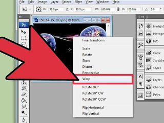
The first image did not fit so I had to use photoshop on the image and use the warp tool to stretch the arms and legs so that it would fit on the whole of the 'T'. To maintain professionalism the black background within some of the text had some white in it which contrasted which disrupted the consistency of the colours. 

For the shot above 'The Crypt' logo, there is what is called a 'fantasy eye effect' on my eye to highlight the 'unknown' essence within the scene. This could have be done via photoshop for every single frame within the short shot but that would be extremely time consuming, so using Final Cut Pro and I assigned two glossy eyes to some frames which automatically moved with the eye. Points were added on my eyelid so that when my eye opened, the glossy eye showed up with it. This ensured that the effect looks realistic and subtle.


Thursday, 6 April 2017

Mise en scene

Mise en scene

In our film opening, there is two locations. One is in a church and the other is in an unknown cellar-type location. Considering the horror genre of our film, after some further research, we decided to
keep the mise en scene subtle but effective.

Candles

As you can see from this image, a few candles would have added to the eerie atmosphere within the church.The candle would symbolise light within the darkness of life and would also represent illumination. It it the symbol of holy illumination within the spirit of truth. Candles were normally lit in times of death as they signified the light in the next world, Christ being the light. Due to the candles actually being a source of light itself, it also inputted to the lighting within she scene even if it was a small factor. Due to the candles being associated with Christ, we thought it to be a suitable prop for our film opening which is a reason why candles were used in both the scene in the church and the scene in the unknown cellar

Props within church

Due to one of the scenes being inside of a church, some of the mise en scene was already there but we had a choice of which things we deemed suitable for our scene and some of the images on the wall were what we used. There were also large wood carvings and showed this in our opening in the short flashbacks to maximise the tension felt by viewers. A religious symbol belonging to Christianity is the cross. The Cross is used religiously to represent the crucifixion of Jesus Christ but used correctly in horror films  and it can be used as a force against evil. The cross works well with out opening as it relates to stigmata through Jesus Christ. Due to this, the cross was used in both the church and the underground cellar scene. As there was imaginably many crosses in the church, unlike the underground cellar, we didn't have to make one ourselves so we just used the ones maybe in pictures in the walls or the ones in the wood carvings.


Rosary Beads


Here is a Rosary bead necklace with a  cross. A rosary bead is used by Christians and is used as a form of prayer in the Catholic Church. The beads are used to count the component prayers. People devote their lives to the rosary bead and Pope John Paul II called it "among the finest most praiseworthy traditions of Christian contemplation". Popes and scientists have highlighted the meditative and calming values and elements of the rosary bead. We thought rosary beads would also be suitable as it also directly relates to Christ and is a form of prayer and plays a big role in Catholicism .